

Can You Cut a Gem Design for Tilt Brightness?
Can you create and cut a gem design to make the most of a stone's tilt brightness? Learn whether your gem will benefit from this consideration.
5 Minute Read
What is Face-Up Brightness and Tilt Brightness?
Face-up brightness (or brilliance) refers to the light return of a stone/design when viewed from the stone's face (top). In other words, imagine your view as a ray perpendicular to the table. You'll see face-up brightness when looking straight down into the crown.
Tilt brightness refers to the light return from a gem viewed from an angle off of the perpendicular. For example, imagine your view again as a ray perpendicular to the table. Now, tilt the gem 10° up, down, or to any side. You'll see the gem's tilt brightness.
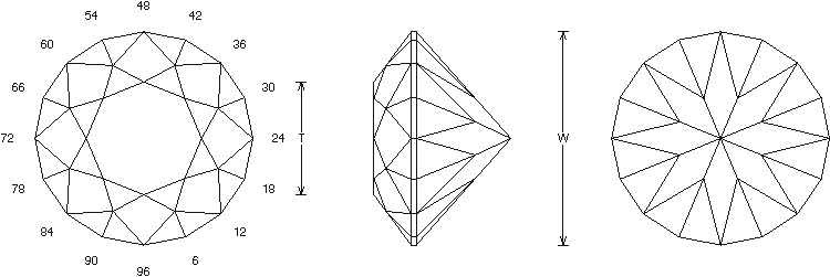
GemCad will calculate the tilt angle of a gem design, perpendicular (face up) to +/- 90° on the x or y axis. You can set your tilt angle when running the GemRay feature.
Can You Design and Cut for "High Tilt Brightness?"
If you're cutting gems with higher RIs, you have a legitimate reason for being concerned about tilt brightness. (For low RI materials, you have to make some compromises for good tilt brightness to become an issue).
For most gem designs, tilt brightness will improve naturally as the RI of the material used goes up. This is just a function of the higher RIs.
To illustrate this, I'm going to go through some standard round brilliant cuts. This will easily show the problems of cutting for tilt brightness. Since it's round, the design can be tilted in any direction without any differences due to length-width ratio (L/W). The round brilliant's high symmetry also gives the best all-around performance in general for brightness, both face-up and tilt.
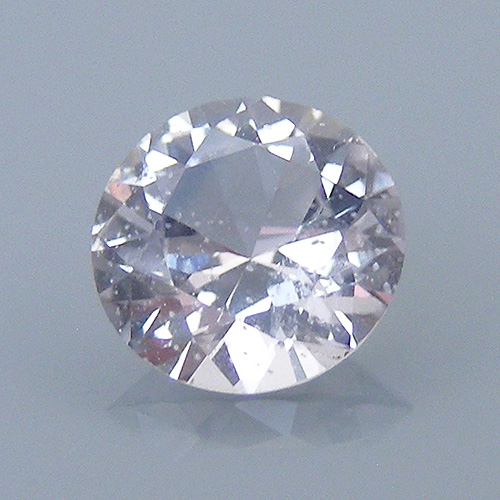
A Standard Round Brilliant Quartz
Below we have a very standard round brilliant, with a 41°pavilion and 42°breaks on the crown. Quartz has an RI of 1.54, a critical angle (CA) of 40.49°.
Personally, I prefer to cut quartz gems, especially lighter colored material, in a deeper design. Of course, for a very dark amethyst, I might choose a lower crown.
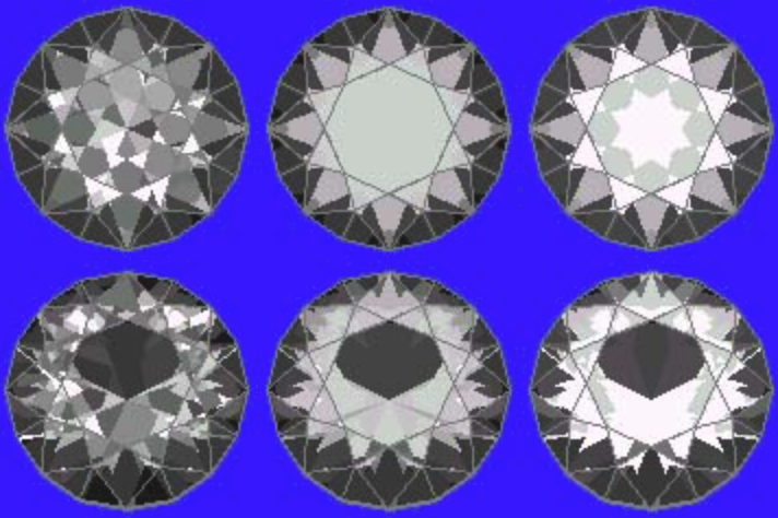
41 ° Pavilion and 42 ° Crown Ray Traces
The ray trace on the top shows the round brilliant quartz, face up. The ray trace on the bottom shows the same stone tilted 10° down along the y axis. (Imagine the pics with the directions north and south. The gem is tilted "north down" 10°).
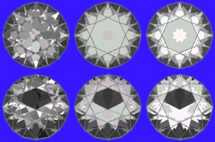
I chose 10° because, as you can see, that creates a large hole. Any greater tilt will just make the hole bigger. Notice the large window (hole in the reflection) that falls out of the stone's reflection, when tilted 10° in any direction.
In the following sets of ray traces, the top rows show the round brilliant quartz design, face up. The bottom rows show it tilted 10° in the same direction as above. Thus, the bottom row shows the design's tilt brightness.
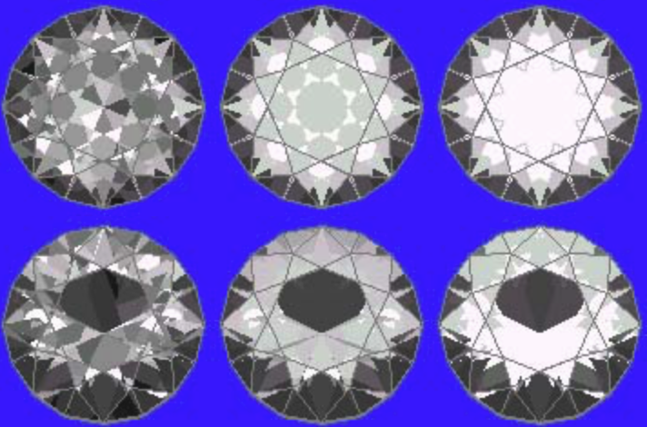
41 ° Pavilion and 34 ° Crown Ray Traces
These ray traces show the round brilliant design, except with the crown lowered to 34°. (I call this a "hubcap" design, due to the low crown).
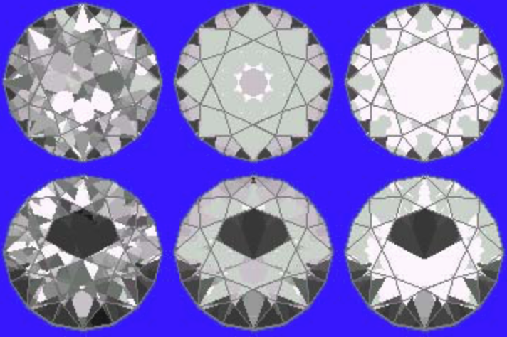
As you can see, the lowered crown angle adds a little brightness around the girdle. However, the window remains identical. Lower crowns won't help tilt brightness at all. In fact, some would argue (and I agree) that lower crowns only lower the overall look of the stone. Of course, others like lower crowns. To each their own on that topic.
42 ° Pavilion and 42 ° Crown Ray Traces
These ray traces show the round brilliant design. However, this time it has a 42° pavilion and a 42° crown.
Note that the window and tilt brightness remains unchanged. In fact the stone's overall brightness is lower because of the extra degree on the pavilion.
42 ° Pavilion and 34 ° Crown Ray Traces
These ray traces show the round brilliant design with a 42° pavilion and a 34° crown.
Note that the lower crown helps brighten the stone slightly, making up for the extra degree on the pavilion. However the tilt brightness and the window still remain the same.
Quartz Test Conclusions
I've run these design tests on quartz, changing both the pavilion and crown angles all the way up and down. The results don't really change much and, optically, their performance is just unacceptable. Even when the pavilion angle goes above 41°, you don't gain any tilt brightness. (Due to quartz's CA, you can't take the pavilion angle below 41°). In addition, you can see that lowering the crown angle helps overall brightness slightly but doesn't affect the tilt brightness. Raising the crown angles will improve tilt brightness a little bit. However, 42° marks as high as you can go and still maintain a decent face-up brightness. In other words, that's about the best compromise available.
Trying this test yourself might serve as an interesting learning experience. Novice gem cutters should find it easy to create a round brilliant in GemCad.
Cutting Sapphires at Quartz Angles
I prefer to cut sapphires at quartz angles. This improves the color (because the stone gains more depth) and yield, as well as tilt brightness.
Here is some proof.
Look at these ray traces of a standard round brilliant sapphire with a 41° pavilion and 42° crown. The second row shows a 10° tilt, like those above.
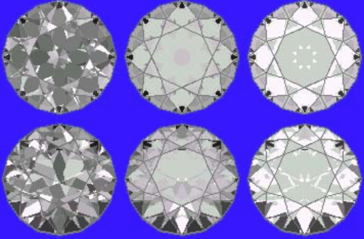
See the difference sapphire's higher RI makes (1.76)?
The face-up brightness on the top row ray traces is great. The tilt brightness shown on the bottom row is also very good. You have almost no loss at a 10° tilt. (You can just see some loss starting around the bottom edge of the girdle).
Tilt Brightness and Lower RI Gem Materials
In conclusion, for lower RI materials (those ranging from 1.54 to 1.62, such as quartz, beryl, tourmaline, and topaz), tilt brightness just doesn't amount to a significant factor. Regardless of the gem design, no tilt brightness is really available because of the low RIs.
How Important is Tilt Brightness?
Even if you have good brightness at a 10° tilt (which is pretty good), that hardly amounts to anything under actual viewing conditions. For stones set in pendants or rings, 10° represents a very small axis change. Just watch how pendants swing. Also, try keeping up with rings on the fingers of people who move their hands while speaking.
Honestly, I'm not sure how important tilt brightness really is. However, if the RI of my material goes high enough, I do design for it. If you're working with high RI material, then take it into consideration.
Be aware that the L/W of a design can dramatically affect the tilt brightness of any design. Depending on the design, you will usually need to make some compromises.


